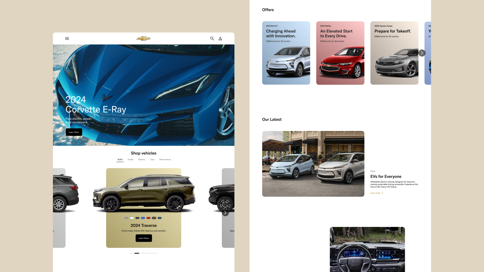
Chevrolet Website Redesign
Time
Jan 2024 – Apr 2024 (14 weeks)
Role
End-to-end research and design
Tools
Figma, Adobe Illustrator, Premiere Pro, After Effects
Jan 2024 – Apr 2024 (14 weeks)
Role
End-to-end research and design
Tools
Figma, Adobe Illustrator, Premiere Pro, After Effects
Background
Chevrolet stands as a major American automotive manufacturer, known for its wide range of lineup,
from compact cars to trucks and SUVs.
Problem
Despite their prominence, their website
needs enhancements.
![]()
1. Price over Features:
Rather than highlighting their vehicles' unique features, the brand focuses on prices and statistics.
2. Complicated Navigation
Multiple menus make the website difficult to navigate.
3. Missing Comparison Tool
Unlike its competitors, Chevrolet lacks a comparison tool.
4. Branding Limitations
The website lacks a highlight color, and uses on basic typography.
5. Imbalanced Content Layout
The content is uneven, with some sections overloaded while others feel empty.
Solution
Redesign the website to highlight vehicle features with
a clearer visual hierarchy, stronger brand identity, straightforward navigation and an addition of a robust comparison tool.


Visual Approach
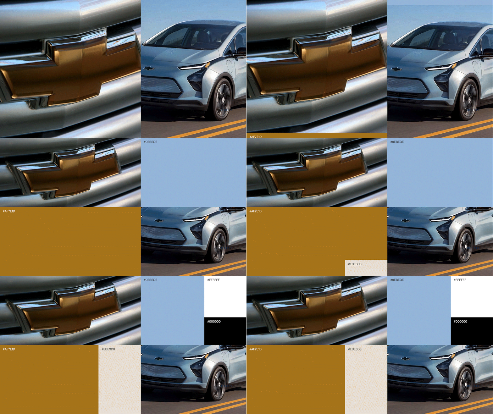
I selected a type style that reflects Chevrolet's heritage as an American automotive company founded in the 1910s. The colors were chosen to mirror the logo and the colors of Chevrolet vehicles.
Typography

Color

Iconography
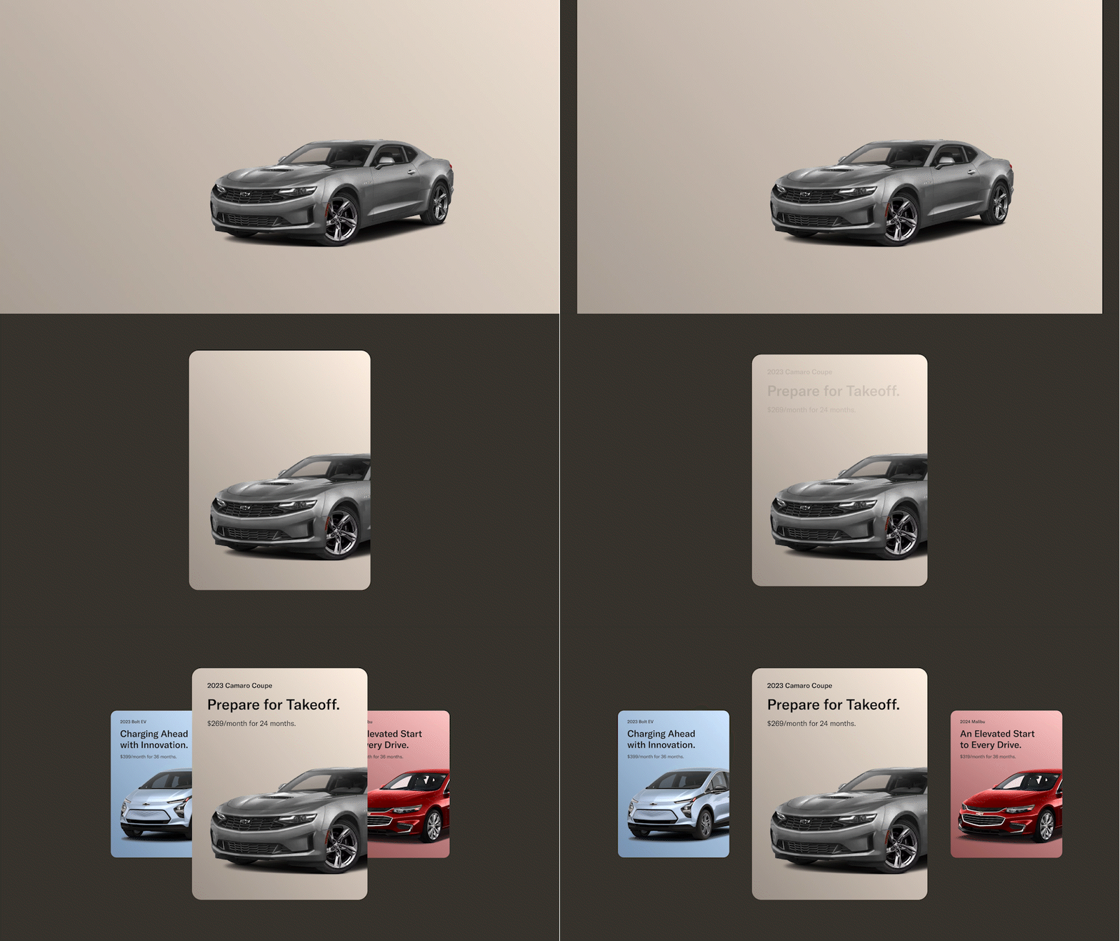
Card Design

